Website design for nonprofits: when to redesign and quick wins that drive results
Your website is your most important communications tool. Unlike social media platforms (which we call "rented spaces"), your website is the one digital property — the story, design, and calls to action – you completely own, without algorithms interfering.
For nonprofits, charities, and philanthropic organizations, good websites are critical because they:
- Serve as your digital front door for funders, grantees, partners, volunteers, and other key audiences
- Build trust before people make donation decisions or spend time on grant applications
- Serve every audience at once (board members, volunteers, journalists, participants)
- Act as a multiplier for all your efforts (campaigns, events, research publications)
Read the full guide below, or check out our webinar recording:
Signs it's time for a website redesign
First, perform the Five Second Audit.
Within 5 seconds of landing on your homepage, can a visitor understand:
- What you do?
- Who you serve?
- What action you want them to take?
If visitors can't answer these three questions almost immediately, you might have a design problem.
Continue auditing the state of your web design by looking for these problems:
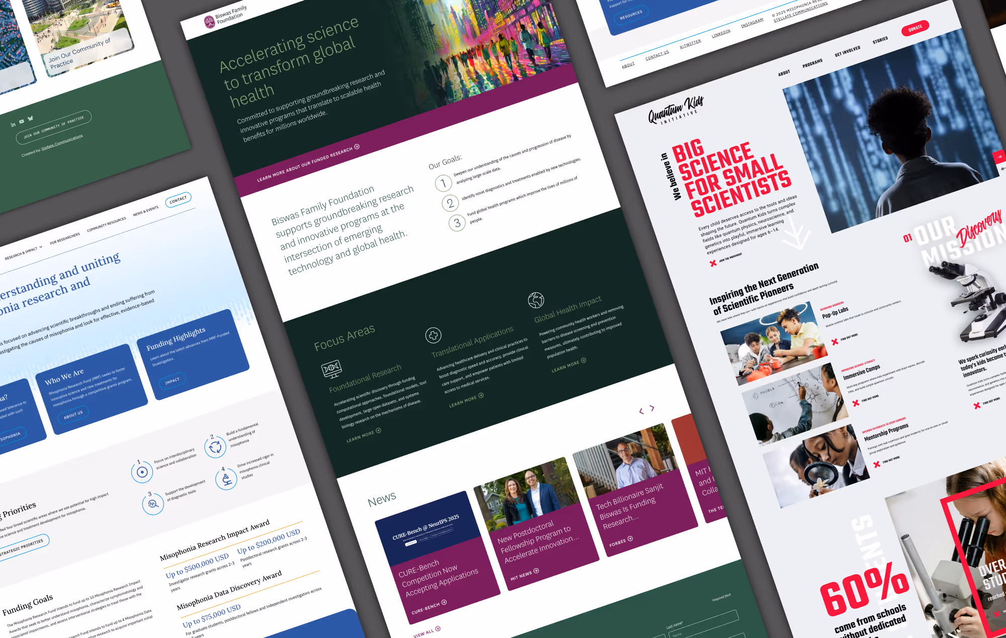
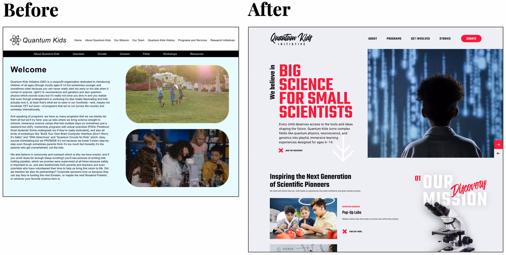
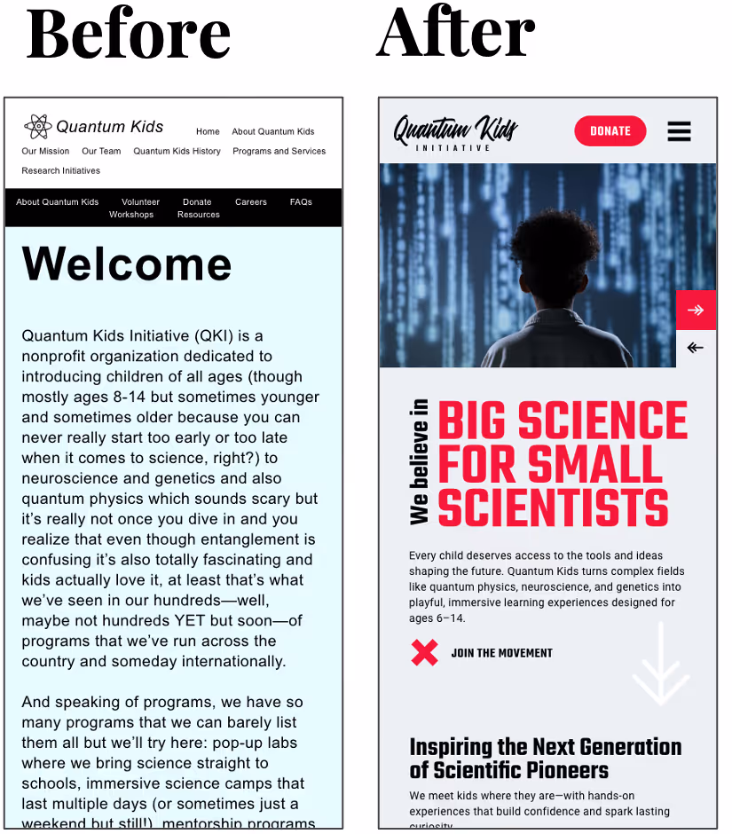
1. Your site looks outdated or doesn't reflect your current brand
- Problem: Visual identity has evolved but website hasn't been updated
- Impact: Creates trust issues when materials don't match across platforms
- Quick test: Compare your website to your most recent annual report or marketing materials
2. Navigation is confusing or cluttered
- Problem: Too many menu items from years of additions
- Impact: Visitors can't find what they need and leave frustrated
- Quick test: Check whether your primary call-to-action link or button (like "Donate") is buried in secondary navigation. How many taps does it take to complete your primary action?
3. Poor mobile experience
- Problem: Text doesn't scale properly, buttons are hard to tap, forms are nearly impossible to complete
- Impact: Lose mobile-first users who make up the majority of web traffic
- Quick test: Open your website on a mobile device and compare it to your desktop site. Can you still read all the text easily and take every action seamlessly on your phone?
4. Declining engagement metrics
- Problem: Flat or dropping donation or engagement numbers
- Impact: Slower progress toward your organization’s goals because the experience creates barriers to action
- Quick test: Look at your analytics. Check your bounce rates, session duration, and conversion rates: have they been improving or getting worse over the past year?
5. Content is too dense or unclear
- Problem: Technical language, walls of text, no visual hierarchy
- Impact: Non-expert audiences struggle to understand your message
- Quick test: Run a paragraph from your website homepage through a free reading level checker – aim for grade 9 - 12 when possible
Quick wins to improve your website
1. Be predictable: move your primary button
- Action: Move your "Donate" or main call-to-action (CTA) button to the top-right corner, if it’s not there already
- Why: Users expect CTA buttons to be on the right and will look for them in that location
- Result: Increased clicks on your primary action link or button
2. Simplify your navigation
- Action: Reduce your site’s main menu to 5 or fewer items.
You can:- Group related pages into categories or nest secondary pages under primary pages
- Add links within each page
- Add up to 5 links to your footer
- Why: Reduces decision fatigue and improves user experience, especially on mobile devices.
- Result: Increased page views per visitor, decreased bounce rate
3. Use visuals to show your impact
- Action: Include impact visuals to demonstrate what your organization is capable of achieving or explain the scope of the issue you address.
Examples:- Photos of your team or work in action
- Infographics or data visualizations
- Icons
- Videos or animations
- Interactive elements
- Why: Visuals help hold attention longer, break up content, and improve comprehension
- Result: Increased time on page, decreased bounce rate
4. Strengthen your headlines
- Action: Make your headings specific and direct.
For example, instead of "Welcome" or "Our Mission", try: "We're helping science solve the world's toughest problems"
Rules:- Lead with value
- Be concise and active
- Use action words like "transforming"
- Why: Visitors want to know why they should care before continuing to explore your site
- Result: Increased time on page, decreased bounce rate, increased engagement
Writing for website visitors
Write content for skimmers, not readers
- Use clear, active headlines
- Keep paragraphs short (2-3 sentences max)
- Include bullet points and numbered lists
- Assume all visitors are in a rush
- Make key information scannable through visual hierarchy
Use content hierarchy
- Headlines should convey your core value proposition
- Subheadings guide users through your story
- Body text provides necessary details
- Visual elements reinforce and clarify messages
- Call-to-action buttons direct next steps
Accessibility considerations
Nonprofit organizations are held to the same accessibility standards as all other websites. We always encourage our clients to meet or exceed WCAG AA guidelines.
Must-have features
- Appropriate color contrast ratios
- Screen reader compatibility
- Keyboard navigation support
- Alternative text for images
- Readable font sizes and families
- Clear language and structure
Tools for testing accessibility
- Web Content Accessibility Guidelines (WCAG)
- WAVE Web Accessibility Evaluator
- axe DevTools
- Color Contrast Checker
SEO and AEO for nonprofits
Search engine optimization (SEO) and answer engine optimization (AEO) are important ways for nonprofits, NGOs, philanthropies, and other organizations to get noticed. But remember, always write for human readers first. SEO and AEO should be secondary to usability for your real audience.
Structure content for AI
- Use clear headings and subheadings
- Include FAQ sections
- Write concise, definitive answers to common questions
- Use structured data markup when possible
Common nonprofit queries to address
- "What does [your organization] do?"
- "How to donate to [cause]"
- "Impact statistics for [your work]"
- "How to volunteer with [organization]"
- "Research findings about [your focus area]"
- “How to apply for grants from [your foundation]”
SEO Tools
- Google Search Console – Free; monitor search performance and indexing issues
- Ahrefs Free Tools – Free; keyword and backlink tools
- Moz – Free option; keyword research and link analysis
- Screaming Frog SEO Spider – Free (limited); in-depth site crawl for SEO fixes
- AnswerThePublic – Free; keyword and question-based content ideas
- Yoast SEO – Popular SEO plugin for WordPress
- Rank Math – SEO plugin alternative to Yoast
- Google Trends – Identifies search trends to inform content topics
AEO Tools
- AlsoAsked – Maps out related questions Google shows in “People Also Ask"
- Schema.org – Resource for structured data markup to improve answer visibility
- Google Rich Results Test – Checks if pages are eligible for rich snippets
Analytics and monitoring
If you don’t already have analytics available for your website, get started using your platform’s built-in tools or Google Analytics.
We recommend tracking and analyzing
- Bounce rate: How quickly people leave your site
- Time on page: How long visitors engage with content
- Pages per session: How much of your site people explore
- Conversion rates: How many visitors take desired actions, like donating or signing up for a newsletter
Analytics tools
- Google Analytics – Web analytics platform
- Microsoft Clarity – Session recordings and heatmaps
- Data Studio (Looker Studio) – Dashboarding and reporting tool
Action plan: your next steps
A full website redesign can take 6 months or more to complete, but you can tackle some design updates in the next 3 months to improve your site quickly.
Week 1: Assessment
- Perform the 5-second test on your current site
- Review your site on mobile devices
- Install Google Analytics (or similar) if not already present
Weeks 2-4: Quick Wins
- Rewrite your homepage headline to lead with value
- Audit and simplify your primary navigation
- Move your primary call-to-action to the top-right
- Add or improve at least one visual element
Month 2: Content Audit
- Review all page headlines for clarity and action
- Break up dense text blocks into scannable sections
- Add bullet points and numbered lists where appropriate
- Ensure each page has a clear call-to-action
Month 3: Review
- Analyze initial metrics changes
- Gather user feedback on improvements
- Plan next phase of updates
- Consider whether a full redesign is needed
Resources for DIY improvements
Website Auditing
- Google PageSpeed Insights – Analyze site speed and get optimization tips
- GTmetrix – Site performance testing with actionable recommendations
- Lighthouse (via Chrome DevTools) – Audits for performance, SEO, accessibility, and best practices
- Hotjar – Heatmaps and user behavior tracking
- Nielsen Norman Group Usability Guidelines – Research-backed best practices for improving usability
- WAVE Web Accessibility Evaluation Tool – Accessibility audits and visual overlays
- SEOptimer – Simple overall audit tool covering SEO, usability, performance, and more
- Broken Link Checker – Scan for broken links
- Stellate’s Web Strategy Checklist – Evaluate how your site stacks up with suggestions specific to science-focused foundations
Content Strategy and Writing
- Plain Language Action and Information Network (PLAIN) – US federal guidelines for clear and accessible language
- Hemingway Editor – Checks clarity, readability, and grade level
- Grammarly – Grammar, tone, and style suggestions
- StoryBrand Framework – Content structuring for clarity and engagement
- Nonprofit Marketing Guide – Articles and resources on nonprofit-specific content creation
Training and Learning Platforms
- Google Digital Garage – Free courses on digital marketing and analytics
- Coursera Nonprofit Digital Skills Courses – Courses on content strategy, SEO, and analytics
- HubSpot Academy – Free inbound marketing and content training
- Nonprofit Tech for Good – Resources on digital trends and best practices
Images, Illustrations, and Graphics
- Canva – Templates for graphics, presentations, and social media
- Unsplash – Free, high-quality stock photos
- Pexels – Free stock images and videos
- The Noun Project – Icons and simple illustrations
- Figma – Collaborative design platform for custom layouts or visuals
- Adobe Express for Nonprofits – Free premium creative tools for registered nonprofits
- Blush – Customizable illustrations that can match brand style
When professional help is worth the investment
Signs you might need expert assistance
- Your website hasn't been updated in 3+ years
- Your metrics are showing significant drops in engagement
- The organization is expanding to new audiences or programs
- You have a small team (or no team) and limited time
- You’re trying to meet new compliance requirements (accessibility, data privacy)
- The site needs to integrate with other systems (donor database, fundraising dashboard)
What to look for in a web design and development partner
- Experience with the nonprofit sector
- Understanding of communication in your area of focus
- Portfolio of WCAG AA-compliant sites
- Clear process and timeline expectations
- Ongoing maintenance and support options
If you are interested in learning more about Stellate’s web services for NGOs, foundations, and charitable organizations, reach out to us for more information.
Your website as a mission multiplier
A well-designed nonprofit website isn't just a digital brochure — it's the foundation of your entire digital presence and one of the most effective tools for amplifying your mission.
Whether you implement quick wins or invest in a full redesign, remember that your website serves every stakeholder simultaneously. By focusing on clarity, accessibility, and user-centered design, you'll create a digital experience that builds trust, drives engagement, and ultimately helps you achieve greater impact.
Based on expert insights from Lily Campbell, Creative Director, in our Art and Science of Web Design for Nonprofits webinar.