
Is it good design — or does it just look good?

We all have aesthetic preferences shaped by our entire lives. Some of us love orange; others despise it. Some of us skew minimalist, others maximalist. That's true for us as designers, it's true for our clients, and it's true for every audience we make work for.
Good design and personal aesthetic preference are two separate things — and learning to separate them is one of the most important skills anyone making creative work can develop. Good design is functional. It passes a checklist that has nothing to do with whether you find it beautiful.
Below, we'll walk through three high-impact principles — and how to apply them.
THE FRAMEWORK
The Design Checklist
Good design passes all of these. Poor design fails one or more, and that's enough for it to fall short of its purpose.
Functional Quality: Does it do its job?
- Clarity of communication
- Visual hierarchy
- Legibility & readability in context
- Appropriateness for medium, audience & purpose
Technical Execution: Is it built well?
- Consistency
- Balance & composition
- Technical precision
Usability: Can everyone use it?
- Accessibility & color contrast
- Reproduction viability
- Durability over time
BIGGEST IMPACT, EASIEST WIN
Visual Hierarchy
Visual hierarchy is the deliberate use of size, weight, color, and position to guide a viewer's eye through content in the order you intend. It's the difference between a layout someone can scan in five seconds and one they have to work to decode.
You don't need to be a seasoned designer to nail hierarchy — you just need to ask: if someone reads nothing else, what do I want them to read first? Make that the largest, boldest element. Everything else flows from there.
The goal is always to lower the time it takes someone to parse what's in front of them.
The type scale in practice. A working hierarchy usually needs just 2–4 text sizes: a dominant headline (H1), a secondary subhead (H2), a tertiary label (H3), and body copy. In web contexts, these map to H1–H4; in design software, you'll set rules for each level so the system runs automatically.
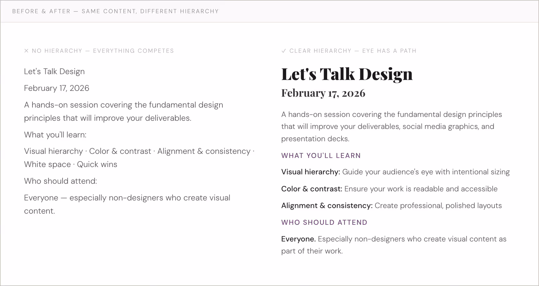
White space does as much work as type. An element surrounded by breathing room signals importance without any increase in size or weight.
SET RULES, THEN FOLLOW THEM
Consistency
Consistency is the systematic use of typography, spacing, color, and alignment across a piece. It's counterintuitive: when you're trying to make something bold, the instinct might be to vary everything for excitement. But variation without a system makes the viewer work harder just to decode the layout — before they can even engage with the content.
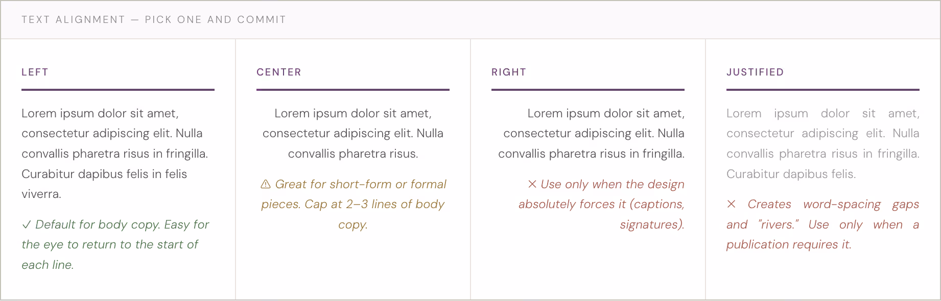
Think of it like driving. You don't have to be the best driver to be a safe one — you just have to be predictable. Same with design. Predictability isn't boring; it's generous. It lets the audience settle into the content rather than fight the layout. A straightforward way to enhance consistency is to choose a single text alignment and use it throughout the entire document.
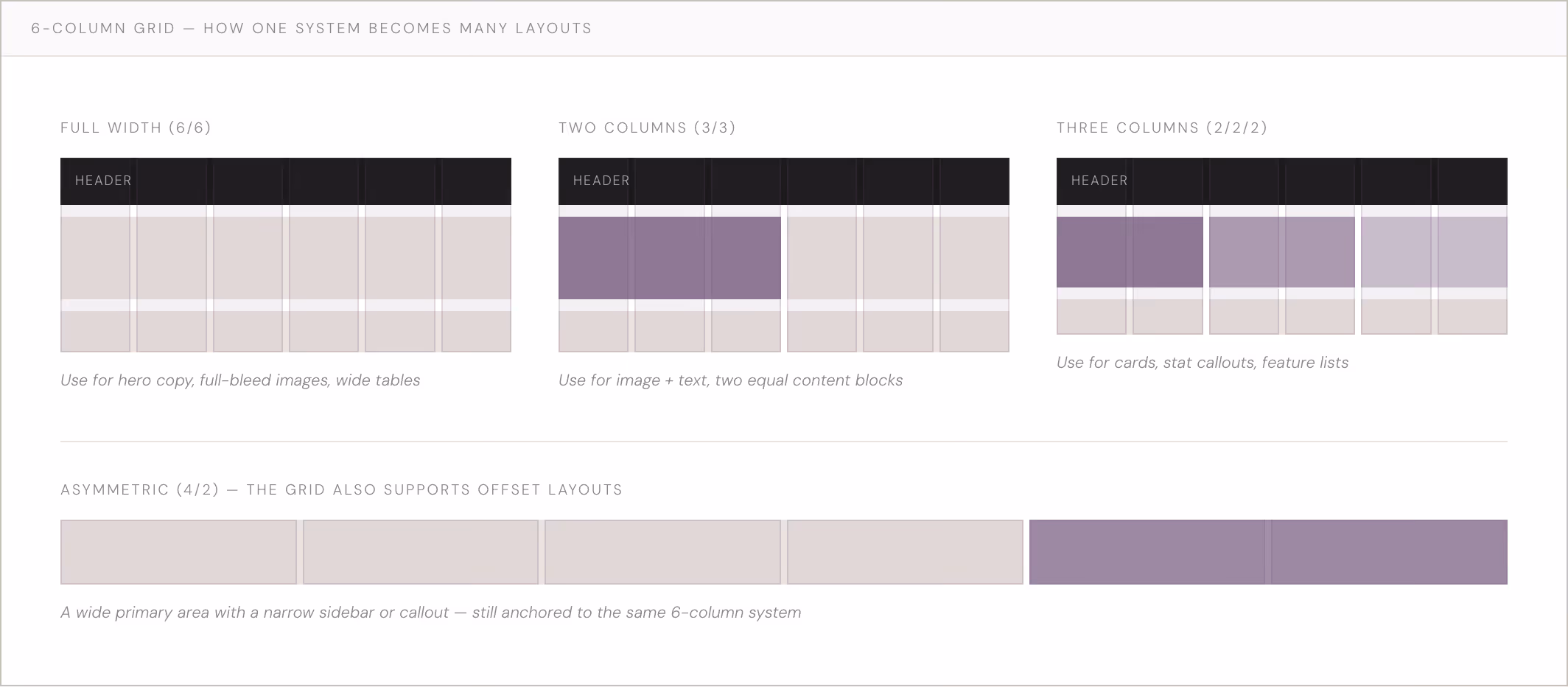
Grid systems. Having an invisible grid under your work helps you stay consistent with minimal extra effort. A 6-column grid is the most versatile starting point — it collapses cleanly into 1, 2, or 3 columns, giving you flexibility while keeping every decision anchored to a consistent structure. When starting a new layout, keep all text boxes and images aligned with grid lines at the beginning and end.
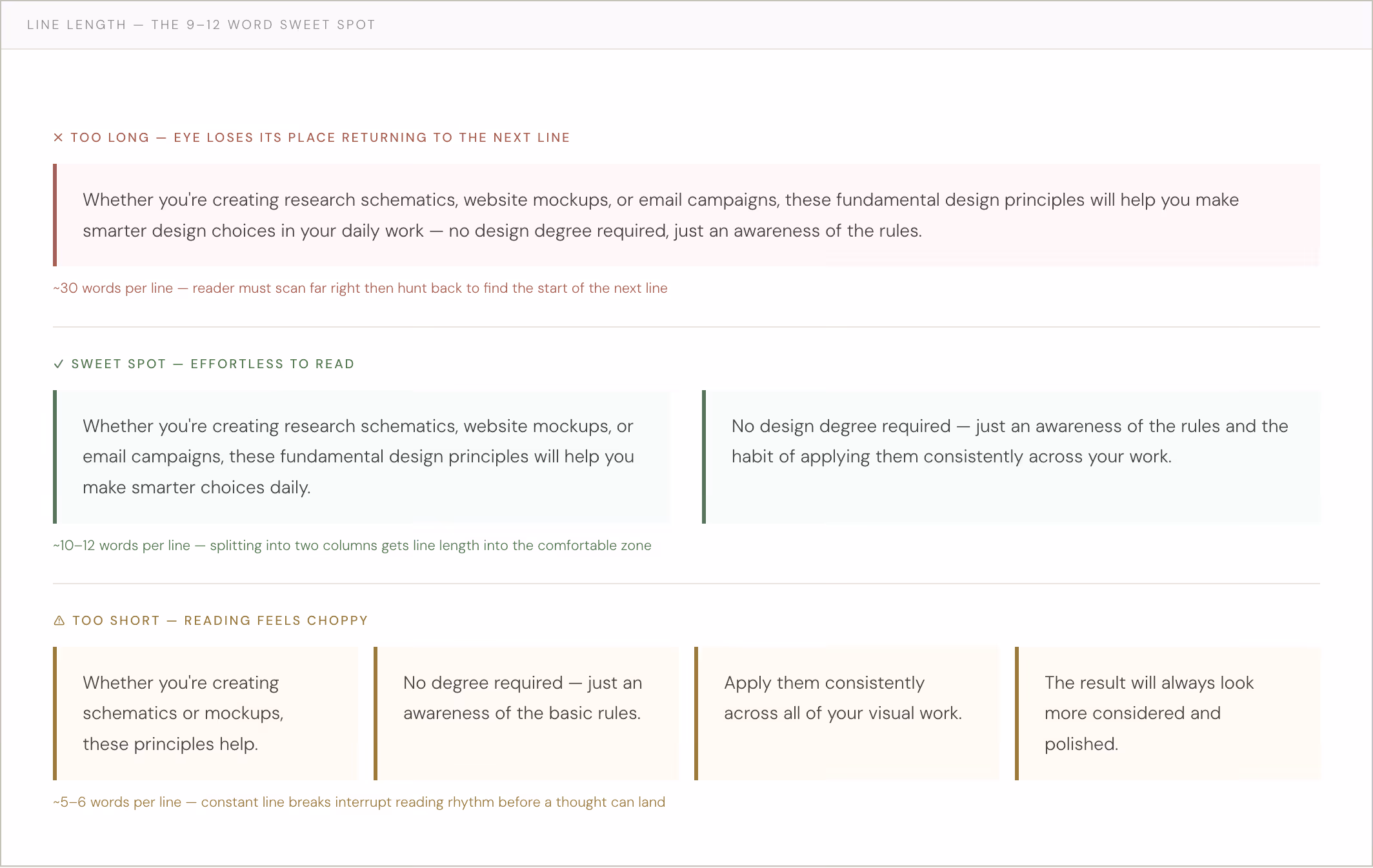
A quick note on line length. Aim for 9–12 words per line. Too short and reading feels choppy; too long and the eye struggles to find the start of the next line. A second column or intentional white space is often the right fix.
A LEGAL REQUIREMENT AND GOOD PRACTICE
Color & Contrast
Roughly 1 in 4 people have some form of vision impairment.1 Color contrast isn't just a nice-to-have; for any digital work, it's a legal accessibility requirement under WCAG guidelines.
Contrast is expressed as a ratio: the luminance of text relative to its background. The higher the number, the more readable. A ratio below 4.5:1 for small text means a portion of your audience simply cannot read what you made — regardless of how beautiful it is. The design has failed its primary function.
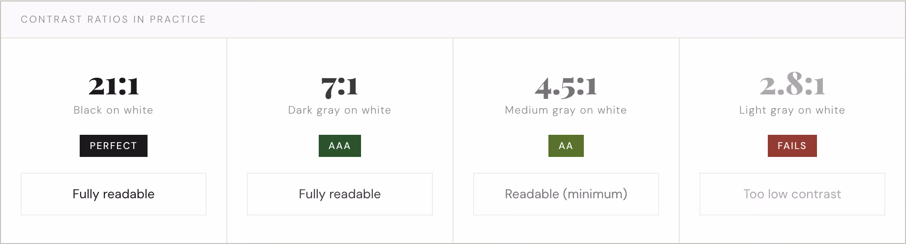
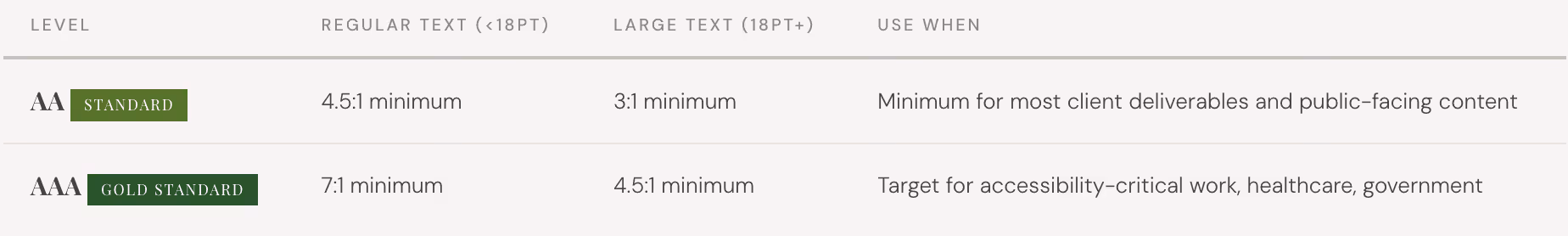
The minimum ratios to know. For regular text (under 18pt), AA compliance requires 4.5:1; AAA (the gold standard) requires 7:1. For large text (18pt+), those thresholds drop to 3:1 and 4.5:1, respectively.
Free tools to check your colors
Enter any two hex codes and instantly see your ratio, AA/AAA pass/fail, and suggested fixes. The go-to reference.
Visual contrast checker with a color picker — great when you're working directly in a color palette and want to test combinations quickly.
Enter your full brand palette to see a grid of every possible text-background combination — invaluable when building a color system.
When your colors fail: five fixes
- Darken your text color. That light gray almost always just needs to go darker. It's the quickest fix and often the only one you need.
- Add a background. If you need light text over a photo or color, add a solid or semi-transparent panel behind the type to create sufficient contrast.
- Increase text size. Larger text has more forgiving requirements (3:1 vs. 4.5:1). Sometimes bumping up a few points is all it takes.
- Use a text stroke or shadow — sparingly. Helpful in constrained situations like text over images. Use with restraint.
- Rethink the color choice entirely. Sometimes a brand color simply doesn't work for body text. Use it as an accent instead.
One more rule: don't rely on color alone to convey information. If a chart uses red for "bad" and green for "good," someone with red-green color blindness loses the meaning entirely. Add patterns, labels, or icons alongside color whenever information is being encoded visually.
Put It to Work Today
Build a type hierarchy
Establish 3-4 text levels (headline, subhead, label, body) with clear size jumps between each. Write them down. Then use them consistently across your next project. Don't invent a new style for every section.
Try working on a grid
Set up a 6-column grid in your next Canva or PowerPoint project. Keep all text boxes and images aligned to it. Notice how much faster decisions get — and how much more intentional the layout looks — when everything has a system.
Check your contrast
Before your next piece goes out, run your primary text/background combinations through WebAIM or Coolors. If anything falls below 4.5:1 for body text, fix it before you share. Build this into your review process.